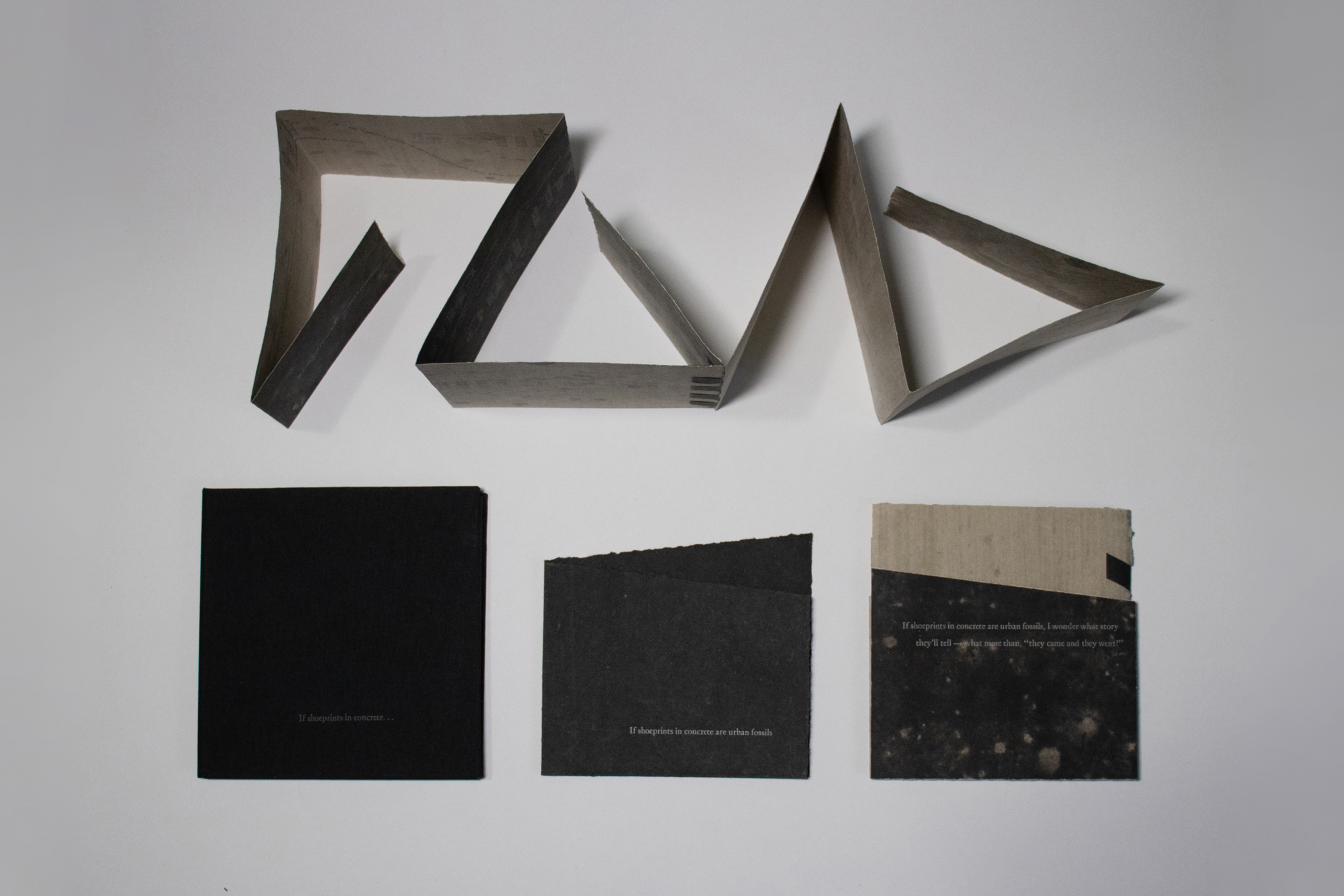
If shoeprints in concrete are urban fossils was written and produced in the fall of 2021. The book leads the reader through a sequence of vignettes of existential contemplations on meaning and mortality. The prose is introspective, expressing a slight paranoia of being watched, surveilled, and followed.
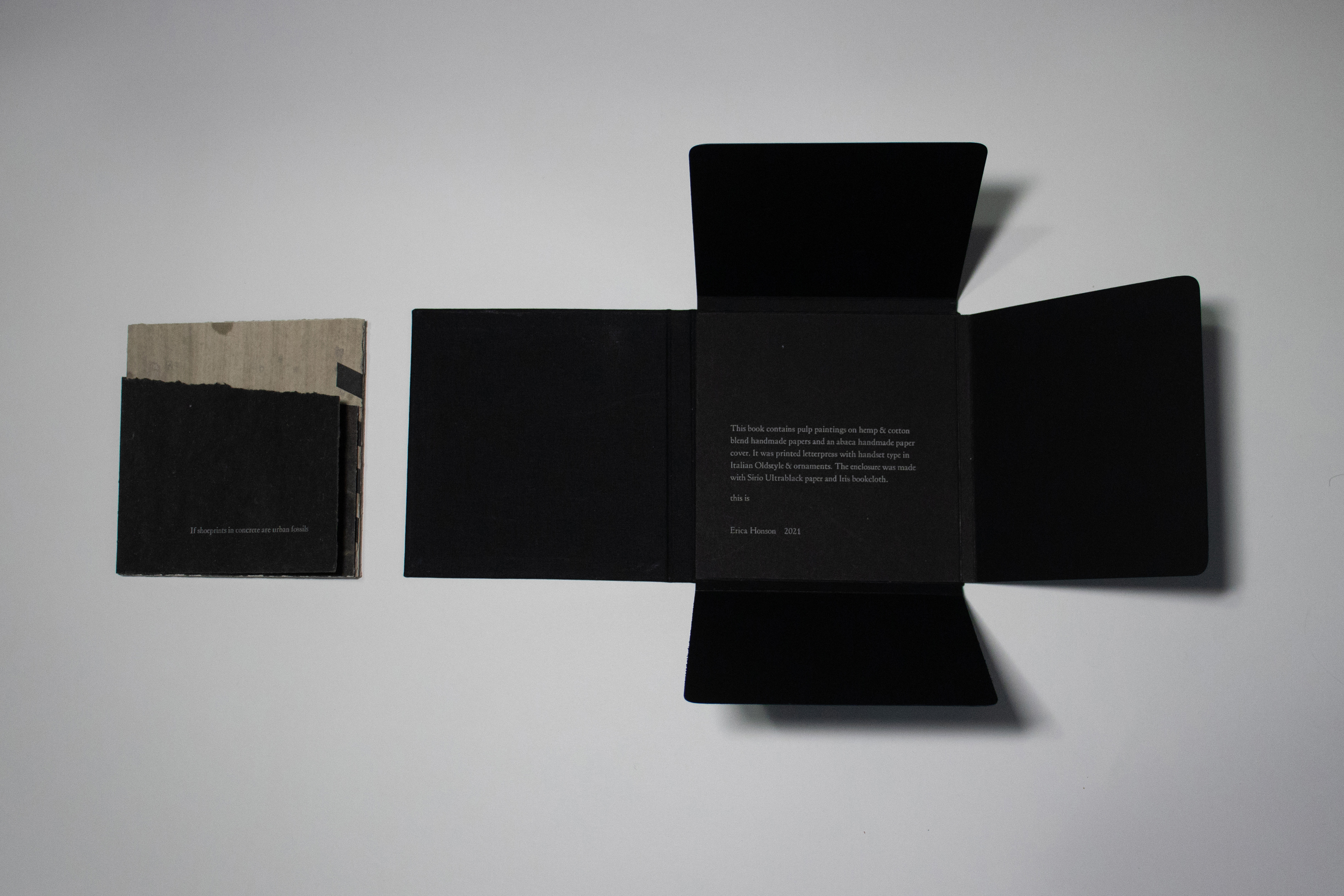
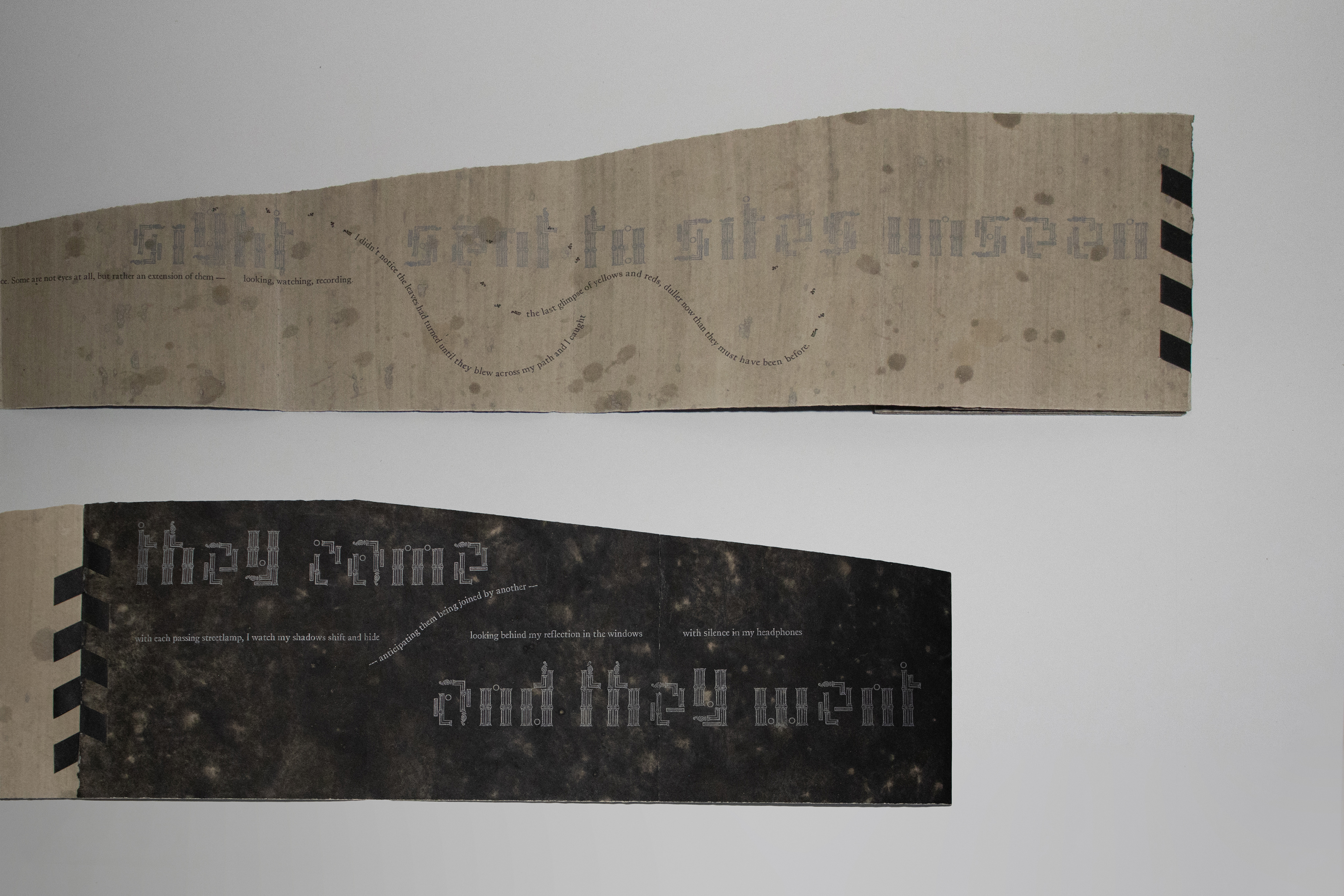
Hemp and cotton blend handmade paper was chosen for its strength, rigidity, and tactile qualities. The natural color of the fibers was used as the background for pulp paintings inspired by sidewalks and concrete textures. The look is softened by the fibrous visual texture of the black abaca cover and all deckled edges, torn or left uncut. The binding is a variation on an accordion with two sheets joined by a woven hinge. It can be read as a codex with fold outs, standing fully open, or somewhere in between. When the reader reaches what appears to be the back of the book, they will find that they have not reached the end. The binding was designed so that the book could be read cyclically — the reader is led around the pages and back through to the beginning.
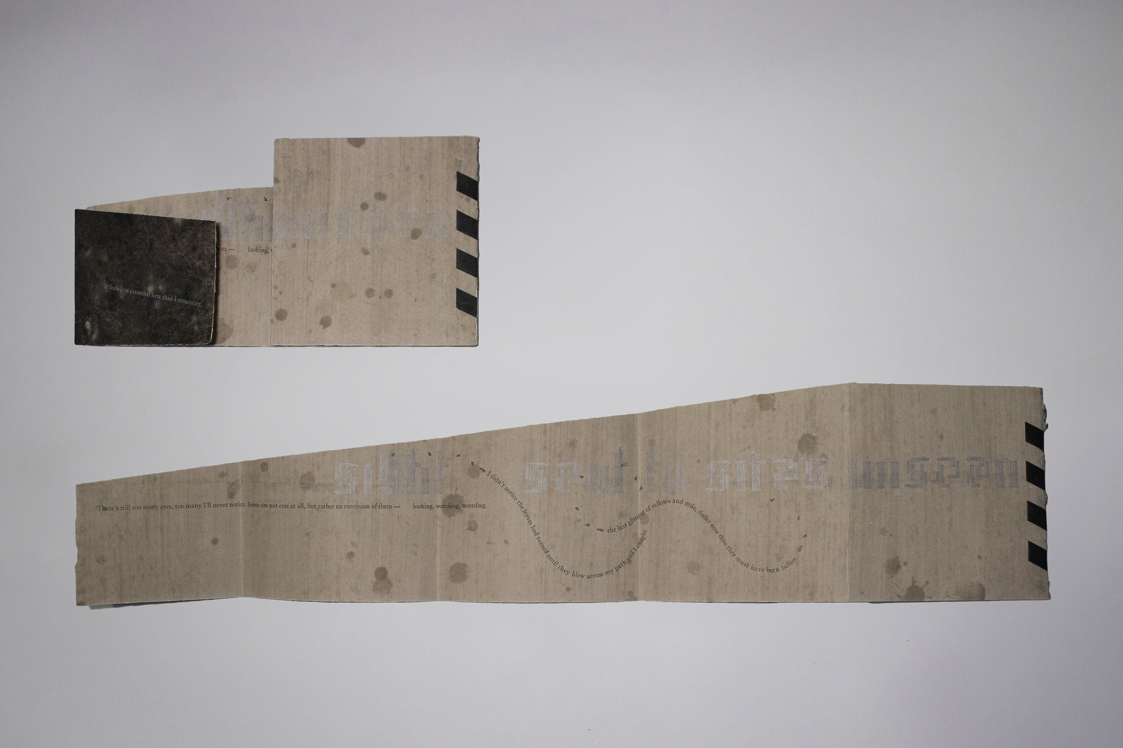
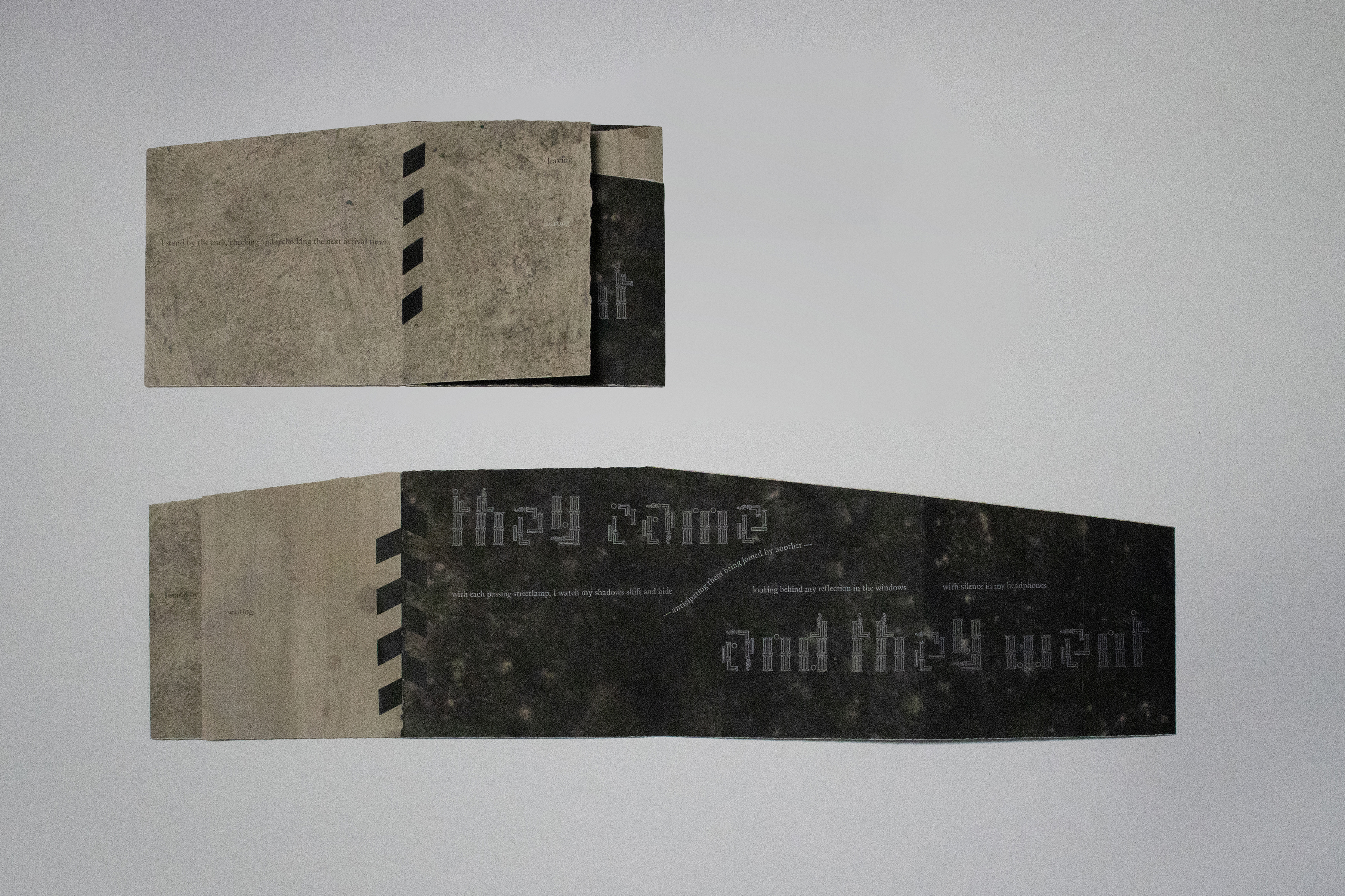
The typography functions as imagery, illustrating movements described in the prose. While the text is sometimes set in a non-traditional way, its presentation along a single line guides the reader through the book. This plays with how readers are used to reading, and grounds them even if they become distracted by the unfamiliarity of the binding structure. While the majority of the prose was handset in Italian Oldstyle, the two lines of fleeting thoughts were handset with modular letterforms designed using ornaments. Modular typography challenges the legibility of the text through abstraction, forcing the reader to slow down. The ornaments used make the characters look architectural, implying buildings or structures along the narrator’s path. Designing and hand-setting these letterforms in addition to the type on a curve elevates the craft of letterpress by using it as a medium for artistic expression as well as a means of production.
If shoeprints in concrete are urban fossils was written and designed for the reader to experience and get a sense the narrator's surroundings and state of mind. The text is a fragmented and narrated stream of consciousness; the type on a curve suggests movement perceived in the periphery of the narrator while the modular typography implies place. The reader's hands wander around the book like the narrator along their path; the paper is the sidewalk passing beneath the narrator’s feet.